What Dry January taught me about branding & design
Why is alcohol-free packaging both brilliant and terrible? How do 0% gin alternatives justify their premium price tags? Did I really make it to the end of Dry January? Who on Earth stole my Batman lunchbox?!
I’m waving around a giant boozy shoehorn as I write this one.
Sorry about that.
Yes, I did ‘Dry January’ a few months ago. If you’re not familiar with the concept, people stop drinking alcohol at the start of the new year to prove that they can.
The more optimistic folk do it to raise money for charity. I’m not one of those people. I’m just a scumbag who avoided the sauce. The turps. The pocket rockets - those wee boys you get on a flight. Miniature heroes.
BUT. This isn’t about how I felt at the end of the ordeal; it’s about what I observed from a graphic design perspective.
So stay with me as I report my findings from my field trip deep into the sober sector. It taught me a lot about visual communication and the importance of good, clear signposting in situations where the wrong choice can have some pretty intense consequences.
Alcohol-free packaging is both brilliant and terrible
The quality of design in the beverages sector is at an all-time high. You only have to walk down a spirits aisle in your local supermarket to witness it. People are turning up and playing hard.
This translates to alcohol-free products as well. And this is where I get confused.
Let’s boil down the choices that brands have:
- Make the 0% stuff so obviously different than alcohol that you can point it out a mile away.
- Make the 0% stuff look exactly like alcohol so you have to look closely to know the difference.
Most companies yank the steering wheel and veer directly into number 2. I don’t know how I feel about this.
On the one hand, being a non-drinker is still somewhat a rarity. Things are getting better as we stumble out of the stone age, but I’ll often be in the presence of a non-drinker who gets asked why they aren’t boozing.
Holding a can or bottle of something in disguise stops this and allows them to hide in plain sight.
But is this bad design? If packaging design aims to communicate the contents visually, then surely it should be painfully obvious? Like the little red ends of toy guns or warning labels on bleach. What if somebody thinks they're drinking alcohol-free beer, and drives home with a few units in their system?
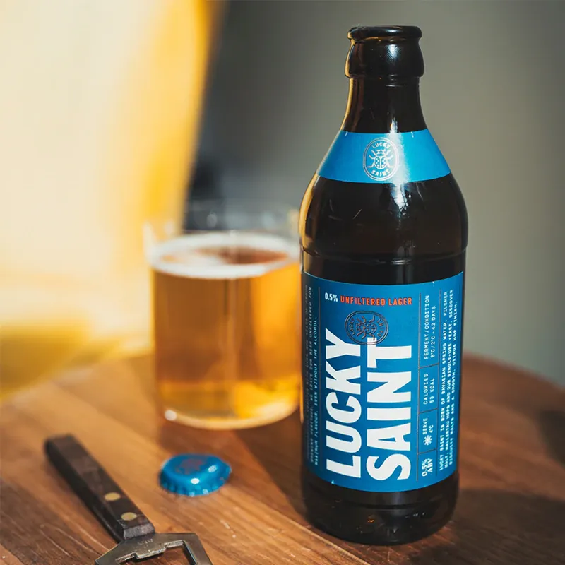
Compare these two bottles:
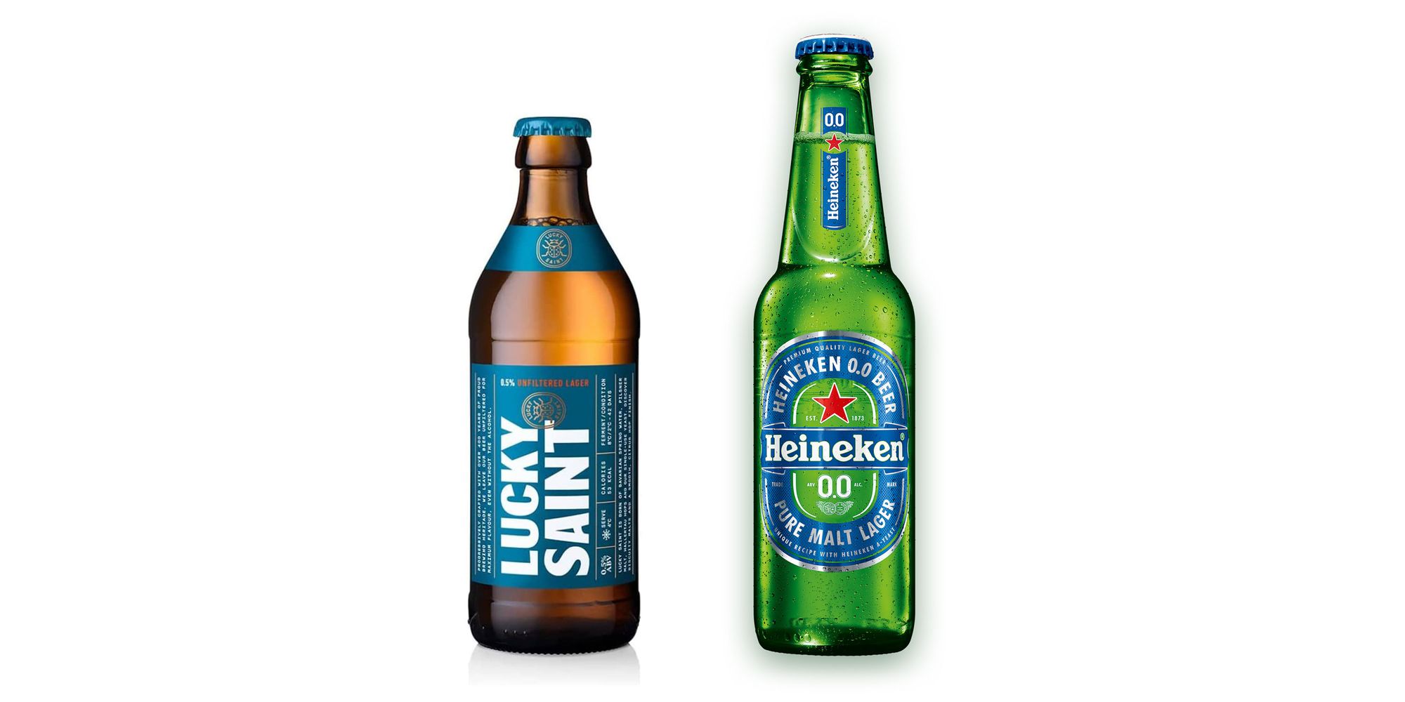
The Lucky Saint could be the real deal. But the Heineken 0.0 is definitely going to provoke questions at Great Uncle Kopparberg’s barbeque next summer because:
- The zero alcohol messaging is more prominent
- Heineken is a more established brand, so the introduction of blue will stand out
What are your thoughts? Let me know in the comments below.
Association is a powerful thing
When I was wandering around the supermarket looking for non-alcoholic drinks, I had the following choices:
- Choose a 0% version of a beer I recognised
- Take a punt on something new
The latter was difficult to do in most places, as the big boys had muscled out the small breweries. Shelf space is limited, and familiar names filled them. Brand association is powerful, and it’s reinforced when it’s the only option.
It sounds obvious, but smaller unknown brands have to work exponentially harder to end up in somebody’s basket. Even when the customer is actively looking for an independent brand.
Education is key
I’m pretty new to the world of alcohol alternatives.
What is the difference between low alcohol and non-alcohol? Is 0% really 0%? What does ‘light’ mean?
It’s 2022; I have the wealth of human knowledge available in my hand. However, in a busy supermarket, when I have other stuff to get, and I’m late for something, I’m not going to start my research then and there.
For many brands capturing the sober market, education is essential. Think back a few years when vegan diets were criticised for being unsustainable and too low in key nutrients. Campaigns from both the plant-based sector and health professionals changed the narrative. The same is slowly happening for alcohol alternatives, but the inconsistent use of terms on labels hindered my attempts at buying the right thing.
Lifting the sector, not the product, is the obvious route toward public enlightenment.
Value perception is massively skewed
I’ve never really thought about it before now, but alcohol = value.
A £25 bottle of whisky is quite normal. An entry-level price, even. But a £25 bottle of non-alcoholic spirits? It feels a bit mad.
Value perception for any brand is a difficult thing to get right. Go in too cheap, and you can risk commoditisation. Too expensive, and you seem delusional. Cultivating a luxury brand is a fascinating thing to witness. Generally, the following things help:
- Scarcity (whether genuine or artificial)
- Craftsmanship or general difficulty to produce
- Hype (whether organic or manufactured)
- Heritage and history
- Inherent higher quality than rival products
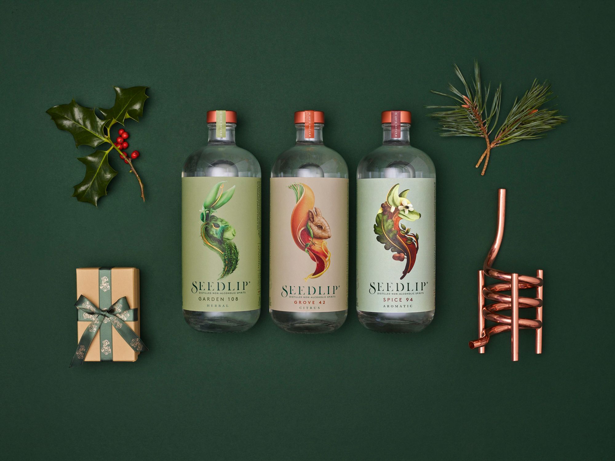
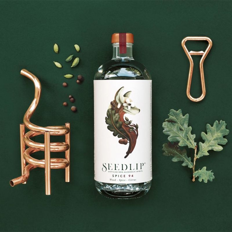
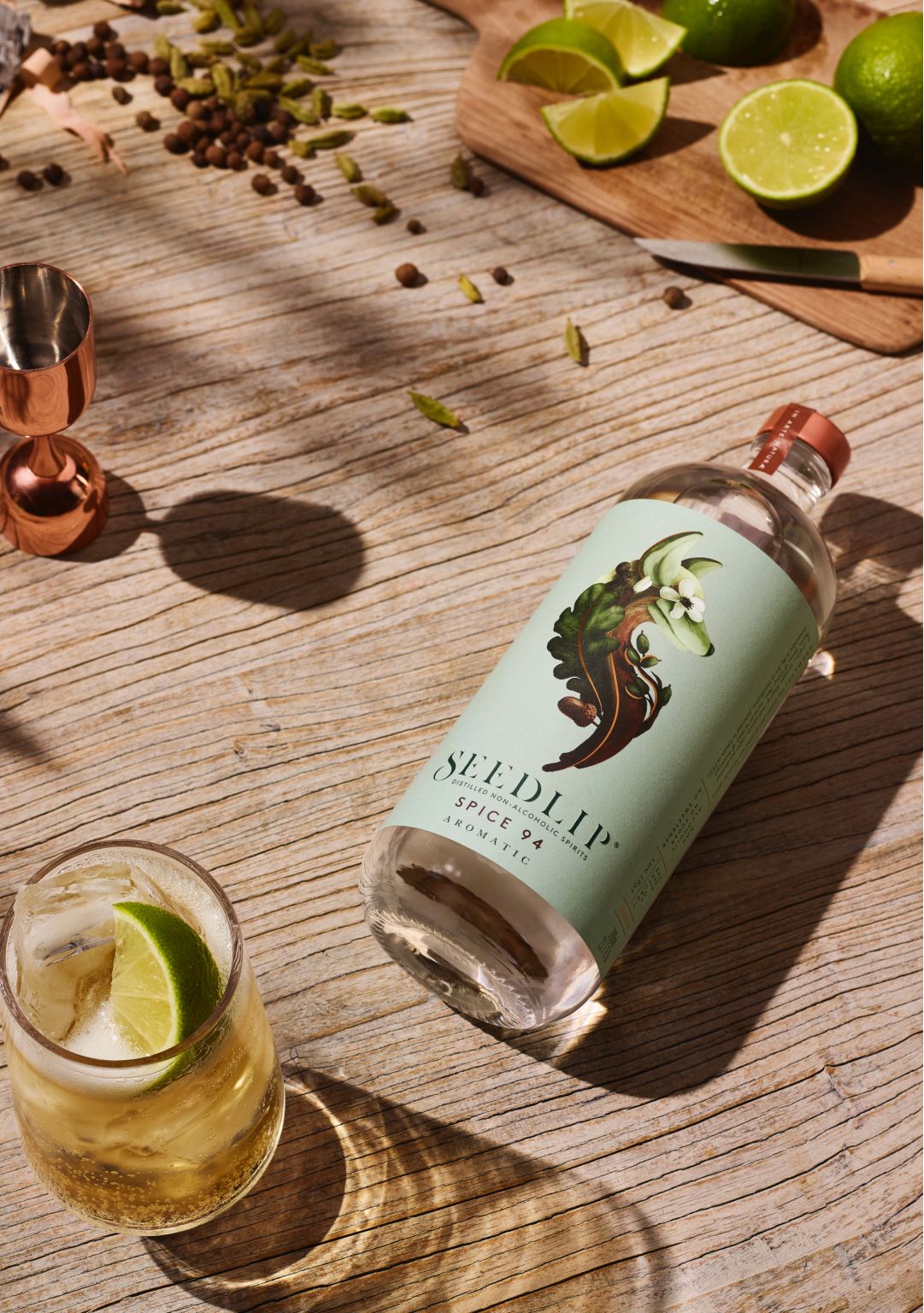
Regardless of the factors, branding is how this perceived luxury gets communicated. A great example of this is Seedlip. Positioned firmly in the same bracket as mainstream spirits, they sell a non-alcoholic gin alternative for £20. It goes as far as a bottle of gin, makes as many drinks, and can be used either with a simple mixer or in your usual lineup of cocktails.
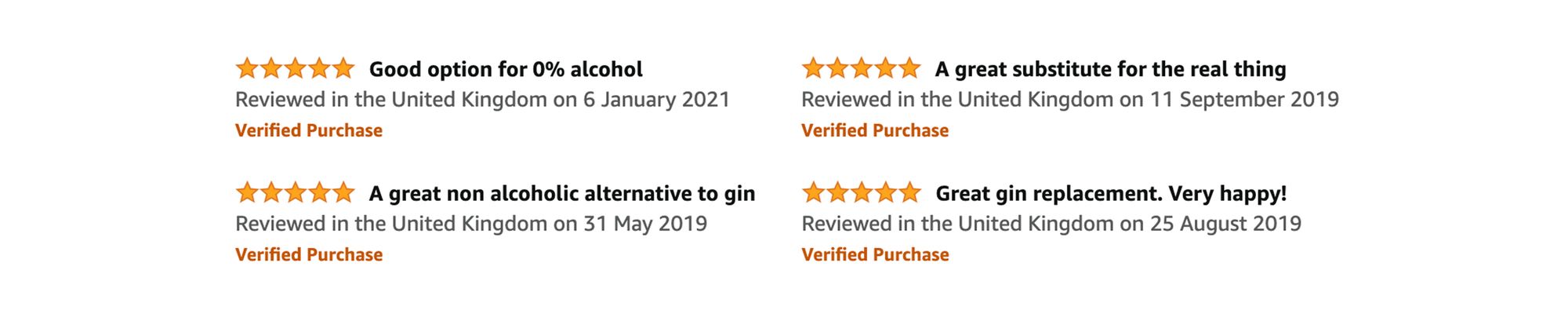
But people are suspicious. The reviews range from:
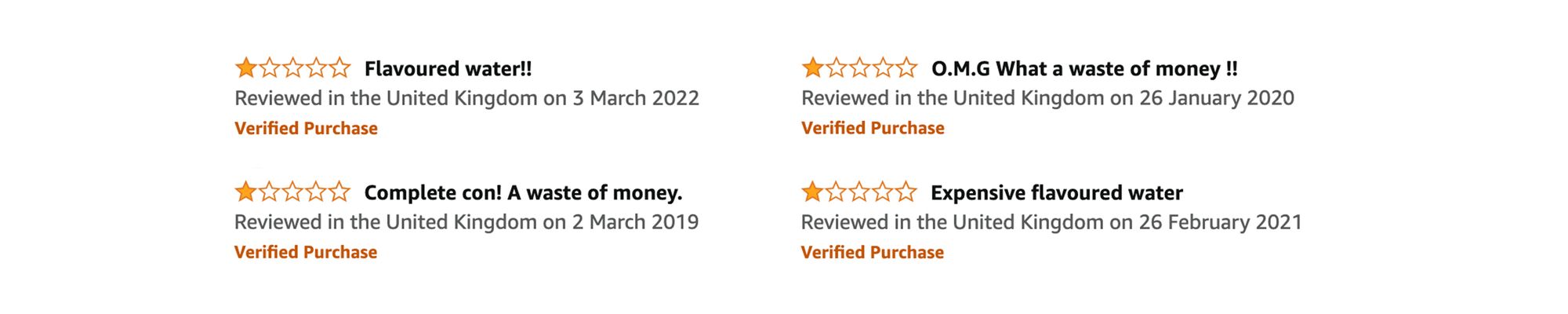
to
Naturally, we assume the cost of a spirit is in the alcohol base. But is it? Surely it’s the heritage, process and idiosyncrasies that separate a £7 bottle of supermarket gin from a £120 bottle of Procera Green Dot?
Why is it absurd to pay so much for a 0% gin alternative when weight for weight, maple syrup costs the same?
Those complaining in their 1-star reviews that it's simply 'expensive water' are describing every alcoholic drink.
Makers of these products have to work twice as hard to instil perceived luxury and not get laughed out of the room. While premium 0% spirits are starting to feel slightly more expected in 2022, there is no real precedent in the sector.
And the main thing I learned? Branding makes all the difference. Seedlip is a great example. Everything they do positions them firmly as a modern, sophisticated boutique spirit. In my opinion, pricing their product much lower would make this far more difficult.
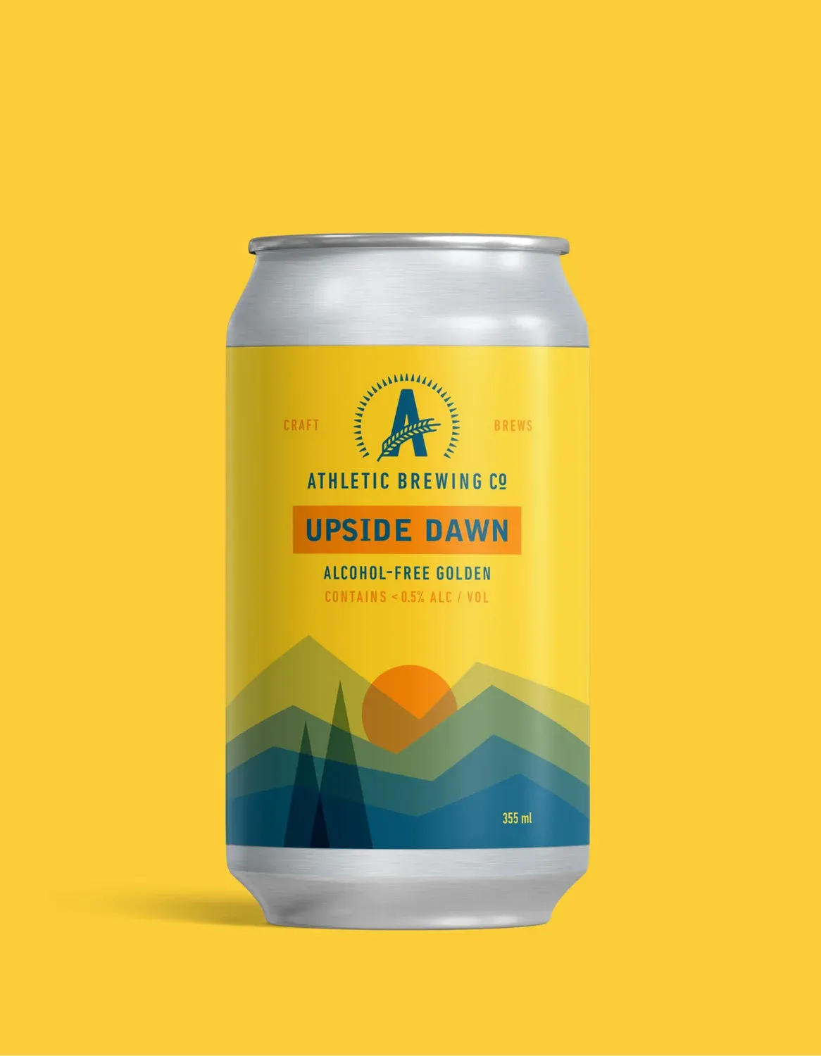
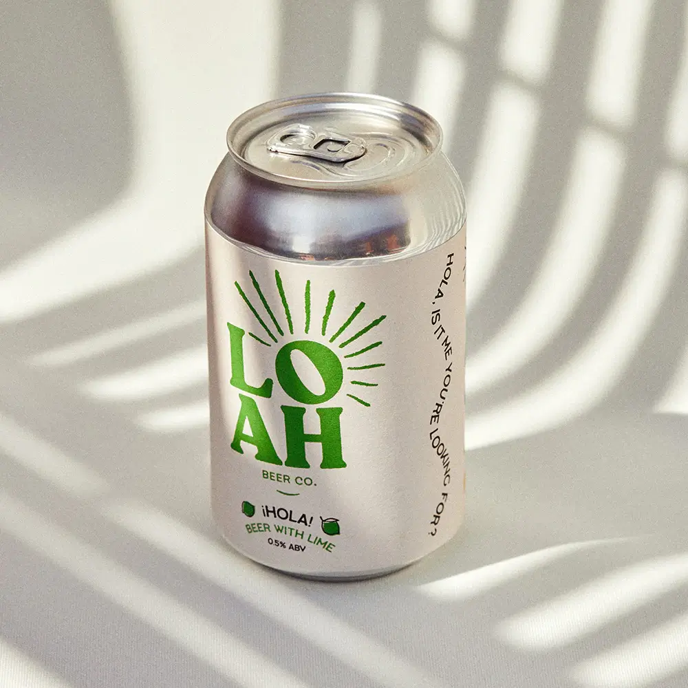
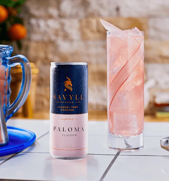
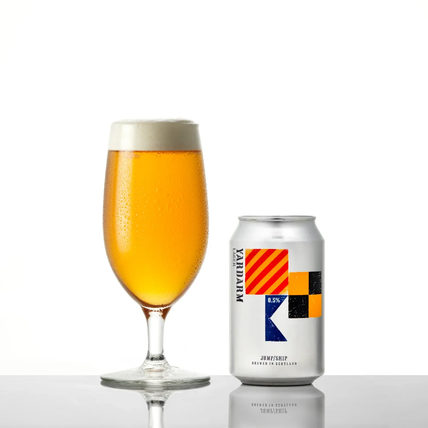
What was I drinking?
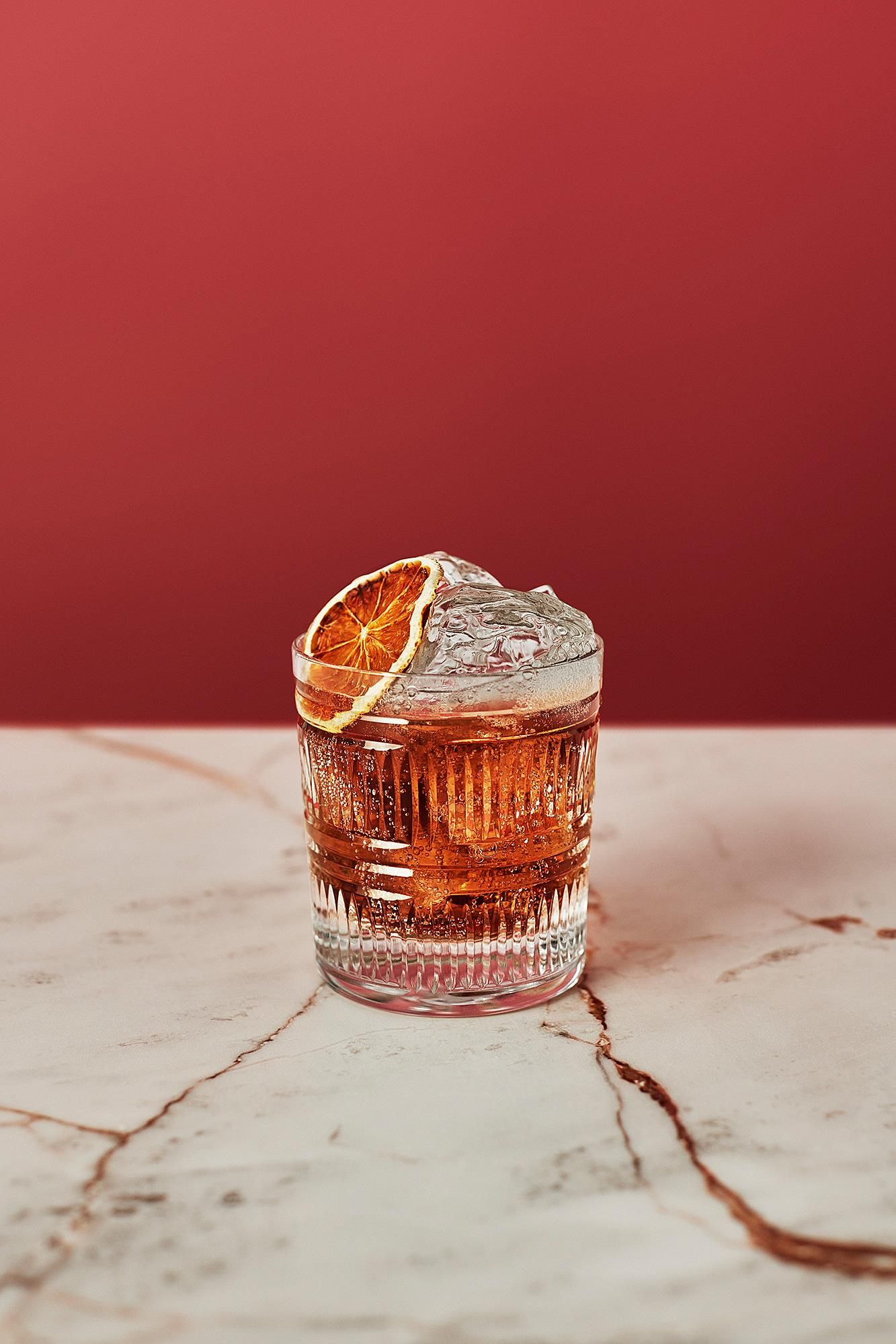
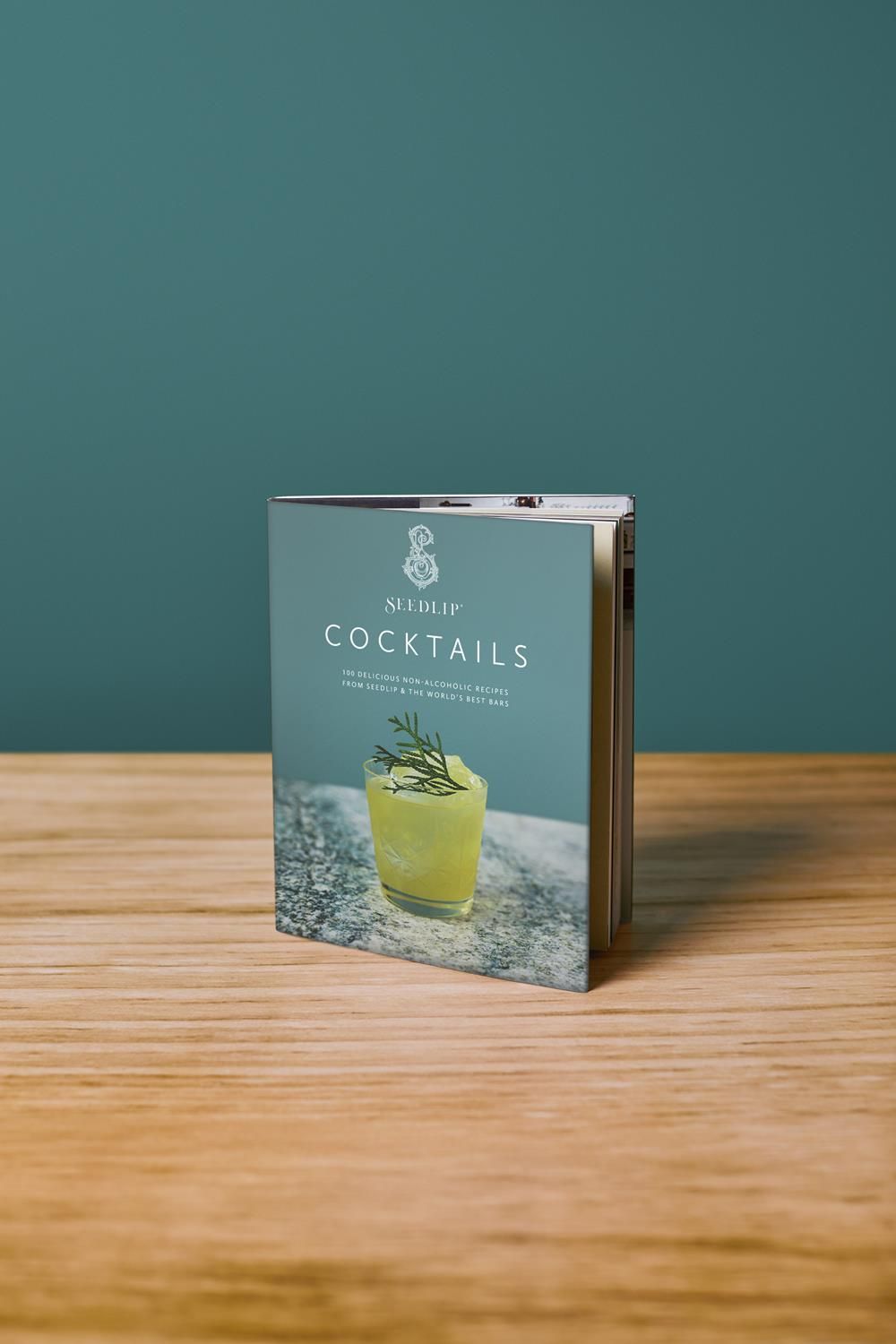
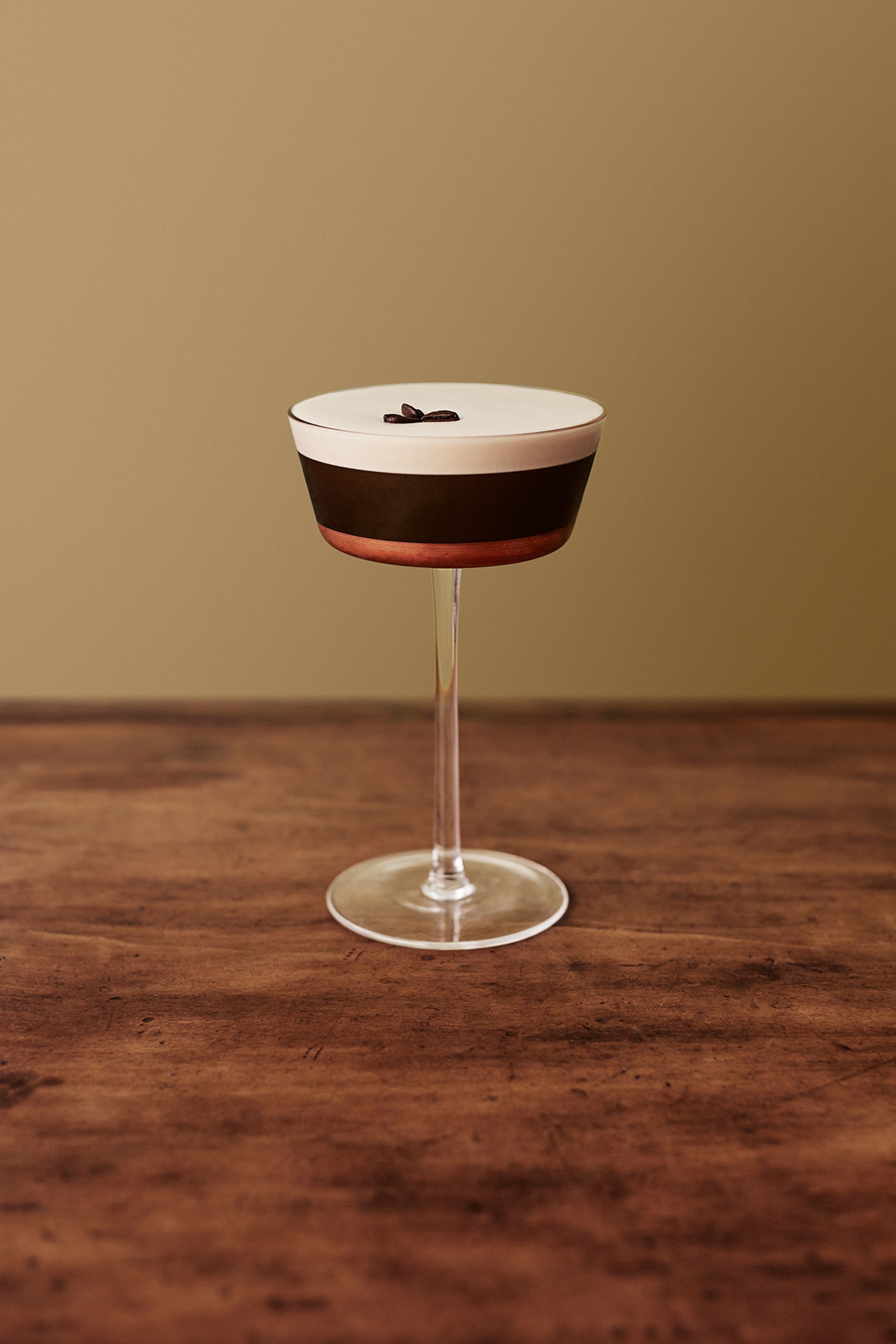
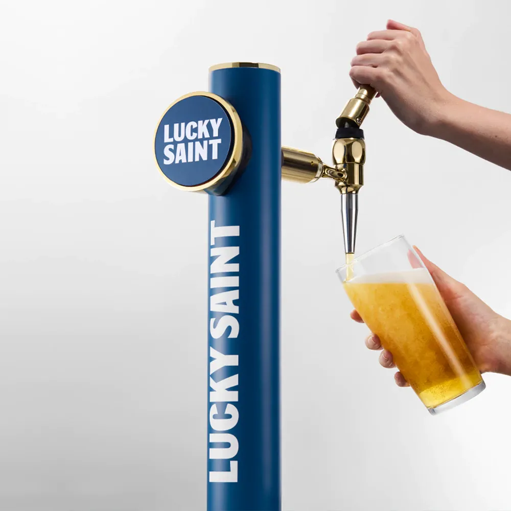
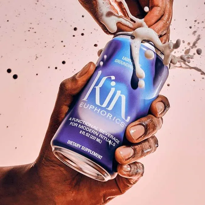
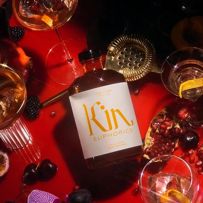
I stumbled across some beautifully designed packaging on my Dry January journey. Here are the highlights:
Dry those eyes
Will I keep it up? Maybe. Alcohol alternatives are surprisingly good. But so is a small glass of Hakushu or a Batman lunchbox filled with Aberlour 12. Let’s revisit this next year.
If you've found this post inspiring, let me know in the comments below. What are your thoughts? Do you agree? Or do you disagree so violently that you want to throw a warm tin of 0% Heineken at me on my driveway? Please don't do that.
For more Inspiration stuff, click here, and for Review stuff, click here. If you liked this piece, you'd probably be interested in this one about useful design podcasts hiding in plain sight, so go there next.
Remember to read that gin bottle before hopping into your hatchback; I'll catch up with you in the next one.
Want new articles instantly?
Join the newsletter list to read pieces the moment they're published.
Subscribe